|
|
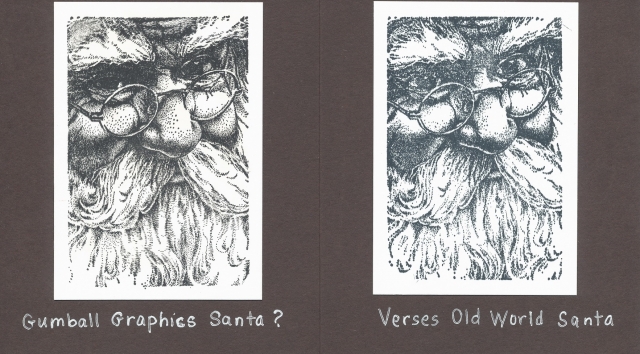
Gumball Graphics Santa (?) and Verses Old World Santa
|
A few days ago, I used what I believe to be the Gumball Graphics Santa on some Christmas cards. When I posted the cards, I mentioned that the Verses Old World Santa I saw online looked the same to me.
Since then, I ordered the Verses Old World Santa. When I compared the rubber of the two stamps, I saw that if I looked closely, there was a slight difference in the way the two stamps had been cast. I think that the same image might have been used for both, but the stamped images are slightly different. There are tiny differences at the end of the beards and in the arrangement of shading dots on the cheeks and nose. My older stamp isn’t as deeply etched as the Verses stamp, and the older stamp disperses the shading dots more. More significantly, the eyes are a bit different. The Verses image has more white around the eyes. I suspect that a stamper could minimize that difference with coloring. I know I’ve seen cards that definitely used the Gumball Graphics image, and there was lots of white around the eyes; now I’m wondering if the artist added the white? I do not know.
Here are the two stamps that I have. The first one isn’t marked at all as to manufacturer, but I still think it’s the Gumball Graphics Santa. The index on the stamp is identical to the one on the Gumball Graphics Santa stamps I’ve seen online. The second is stamped with the Verses Old World Santa stamp.
Daria
|
|