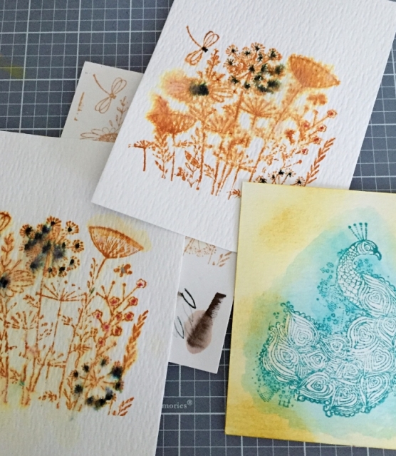
Artsy Inkers

Gallery for Stamping Forum


Home Contact Register Login
Forum Album list Last uploads Last comments Most viewed Top rated My Favorites By date Search
Home > AIR & Summerfest > AIR 2016

AIR16 Vintage WC

These are all my fails, LOL. The brown inks are Distress ink. The yellow is Stampin Up. The blue is Distress ink. The peacock I couldn't get the ink to spread so I put some on a block and did the outside with the waterbrush from the block. It would have turned out ok if the edges were softer. Then the yellow was just a test.
The dark spots on the others are the elegant writer. I stamped the image, dotted it with the elegant writer then spritzed very lightly. Just couldn't get it to look right. There are also fails on the other sides of each of these, lol


Comment 1 to 6 of 6
Page: 1

Far North   [Jun 13, 2016 at 09:20 PM]
Heidi good efforts here! Thanks so much for sharing the details of your experiments. I will add notes about some of my experiences on the discussion thread.
Iring   [Jun 13, 2016 at 10:59 PM]
Thanks for sharing! Spritzing is not a precise technique! I'm glad you didn't give up.
djc   [Jun 13, 2016 at 11:33 PM]
Yeah! Thank you. Sometimes it's nice to see that you aren't the only one struggling with a technique. Your lighthouse piece shows that it's worth it not to give up. Thank you. Daria
howdyheidi   [Jun 14, 2016 at 08:04 AM]
I have that flower stamp. It is so detailed, I see how it would be hard to control. I really think you are getting somewhere with the peacock image. I think you could just add more or darker color around it and it would look great!
Nora S   [Jun 14, 2016 at 01:15 PM]
Playing is how we learn new techniques, and it looks like you had a fun time playing anyway! TFS
CarefreeSadie   [Jun 16, 2016 at 05:18 PM]
LOL! They could probably be saved but the time invested might not be worth it. TFS

Comment 1 to 6 of 6
Page: 1

Add your comment
Anonymous comments are not allowed here. Log in to post your comment